Adding 'Compare Hotels' feature in Yatra
What is Yatra?
Yatra is a travel booking app that allows users to book flights, hotels, vacation packages, etc.

Role
Research, Ideation, testing, UI design
Goal
Design to impact hotel bookings (conversion) and user satisfaction
Time
48 hours
Constraints
Lack of data and time constraints
Target Users
Frequent travellers
Travellers with specific needs
Budget conscious travellers
All aged 18-34 (62.57% of active users)
💡Core Idea
To provide users with the ability to compare prices, ratings, amenities, and services of different hotels to make more informed booking decisions.
💸Business aims to…
- Increase bookings and user satisfaction by making it easier for users to compare and choose the best hotel for their needs.
- It may also lead to increased customer loyalty, repeat business and positive word-of-mouth advertising as users appreciate the convenience and transparency of the comparison feature.
🤔User aims to…
- Save time and efforts in searching for and comparing hotels.
- It will also help users to identify the best deals and discounts available, making their travel more affordable and making the booking process less stressful.


I faced some challenges along the way…
40 + factors for comparison of hotels

How to fit all this information in a mobile screen for comparison?
No time for Primary Research
Without talking to users, how do I find out what they need and expect?
Finding relevant users for testing solutions in very short time
With less than 2 hours available for testing, where to find the users?
Rely on assumptions and intuition for design decisions
How to build trust in design decisions in absence of reliable sources?
So, did I overcome the challenges…?
Have a look at the final outcome of the project, a solution that worked despite having challenges in the problem statement:

Prototype:

How did I do it?
⏳ time taken to present solution — 48 hours

Process
🔶Assumptions:
Following are the assumptions I went ahead with —
🔸As no prior research is being done for this project, I’ll assume that it’s been validated that users desire a comparison feature.
🔸Assuming that the necessary data and information about all hotels and bookings are available and can be accurately displayed to users.
🔸Assuming that users will have specific priorities and preferences when it comes to booking a hotel (such as price, location, amenities, etc.)
🔸Assuming that users will have limited time and attention to devote to comparing hotels, and designing the feature in a way that is quick and efficient for them to use.
Desk Research
The direct competitors (Make my trip, Agoda, Bookings.com, Cleartrip) do not have this feature as of now.
So I started looking for other platforms in and outside of the industry.. who use this feature on their platforms
Amazon
FlipKart


📍Observations:
Users can select products/items from the search results page to compare. (Validates the assumption that the feature will work better in this section)
Comparison is done side by side with all details mentioned in a tabular format. (Vertical scroll)
Direct CTA is added under each item on the comparison page to increase conversion. (Shop now, Apply now)
Ideation and wireframing
I decided to give an option of comparing a maximum of 4 hotels ( As the number of options available even after filtering was a lot, and selecting only 2 or 3 can be difficult, which is again my assumption. However giving 5 or 6 options to compare is not practical for the platform. Hence I decided to give 4 options)
A new challenge emerged in front of me:
📍 How do I fit all this information into the small screen of 360 by 800 pixels? That too for multiple, in this case, 4 hotels?

📍I went back to research. Where else do we compare a lot of information and how do we do that?
The answer: we do this on Dating apps. We compare people by swiping cards horizontally and scroll vertically to view more details about a person.
Can we do something similar here?

Rapid Prototyping and Testing
📍I re-designed the cards displaying hotel information to:
🔸Incorporate the ‘compare’ button
🔸Make images, ratings, discounts and prices prominently visible
🔸Bring hierarchy to the information provided

Prototype Video:
But, this design failed in testing
And I also learned my biggest and most important lesson in design :)
Why did things go wrong? Read on to know!


So, what exactly went wrong?
I forgot the most basic and most important question…
What problem am I solving??!!!
Why would a user WANT or NEED a compare feature?

I went back to step 1 - Research
📍Why do users need comparison anyway?
The answer was very simple: it’s because we as humans have a very short memory span and we tend to forget what we see/read. Having information laid out infront of us eliminates the need to remember anything.
📍The problem that needed to be solved was this:
After viewing details of one hotel, users cannot rely on their memory to recall the details while looking at another hotel and trying to decide which is better. It gets harder as the number of hotels they view and like increases.
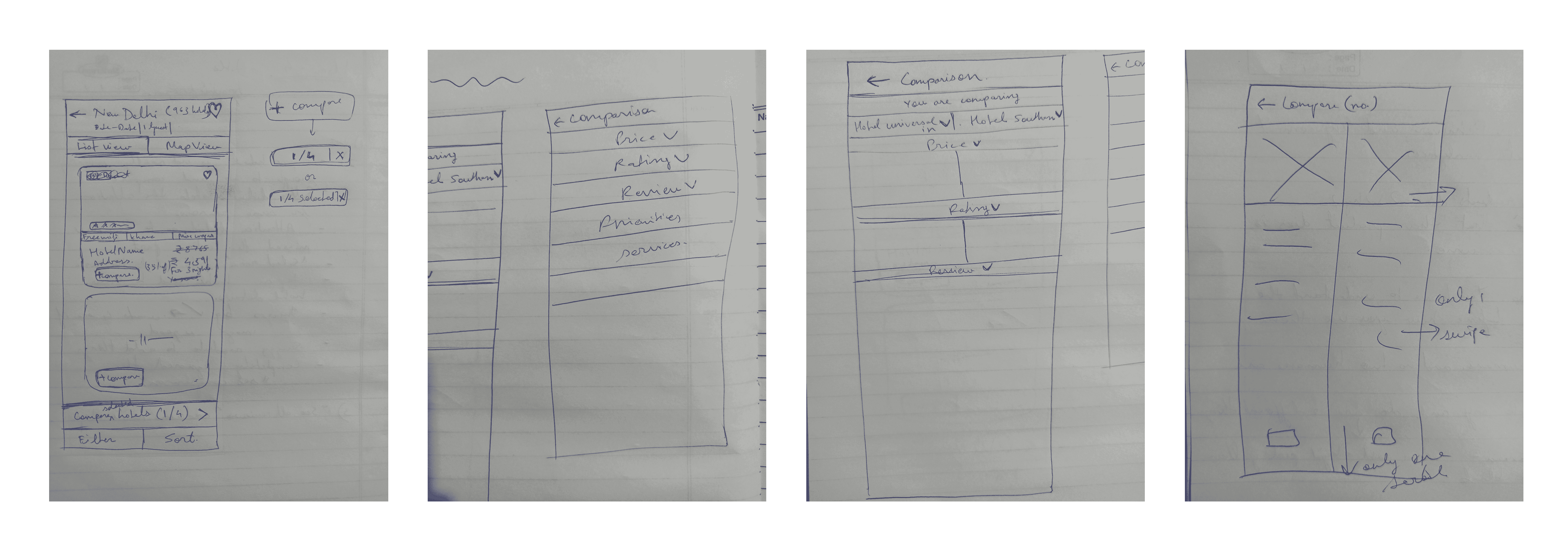
I made wireframes for a few ideas that I had.


Final Prototype again :D
Thank you for going through my work!
I learned the importance of testing your designs and collecting feedback as early and as often as possible.
I could’ve spent more time brainstorming on and understanding the problem I was solving.
And, I could’ve defined my goal clearly at the beginning so I wouldn’t get lost in the process.
Nonetheless, making mistakes is the part of the process, right? ;)
Scrolled till the end? Now give me the job :D
I need money to buy art supplies. And to feed the cat.